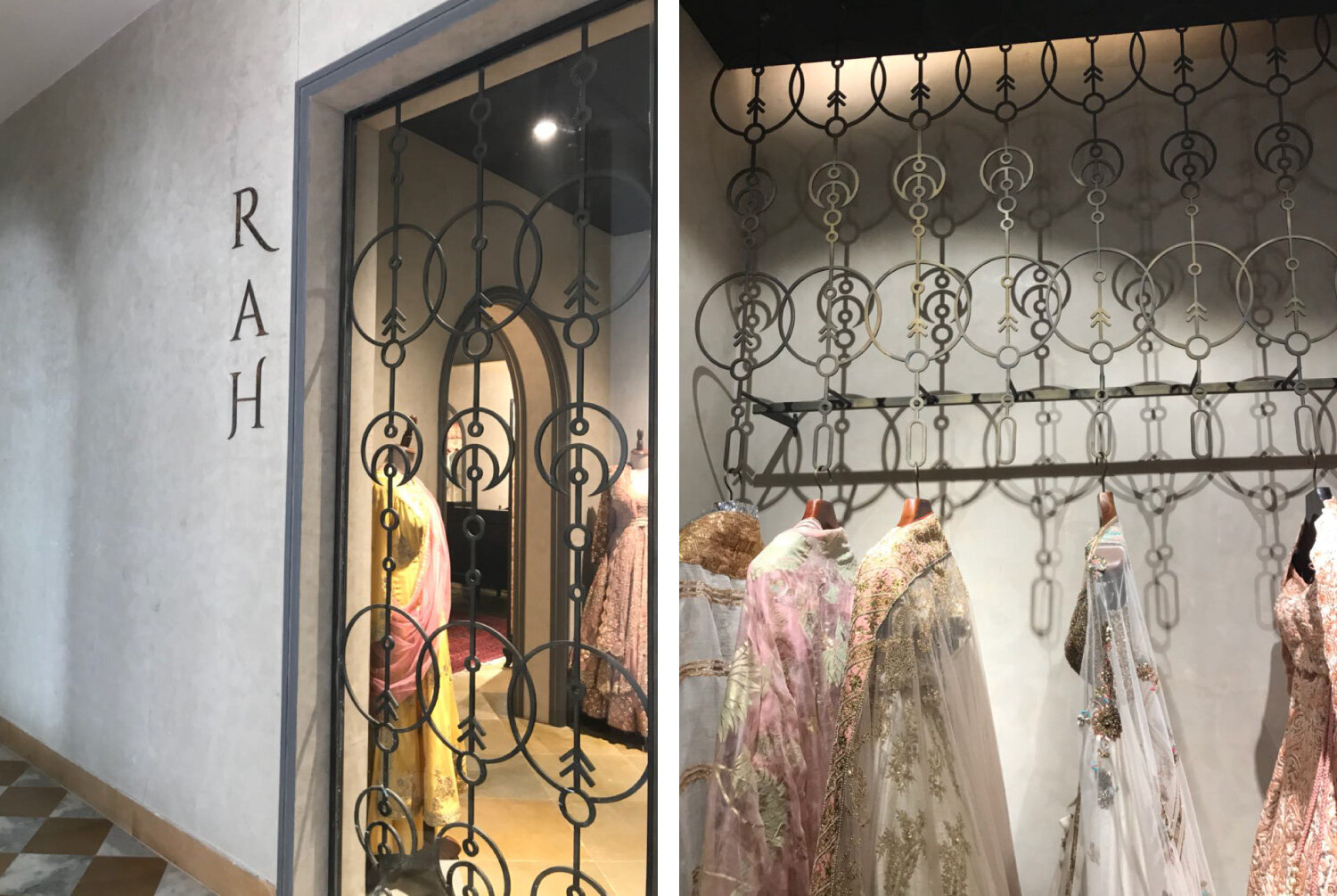
RAH is a couture brand, created with the initials of designer duo Rimple & Harpreet Narula.
Brand Strategy + New Identity + Retail Space


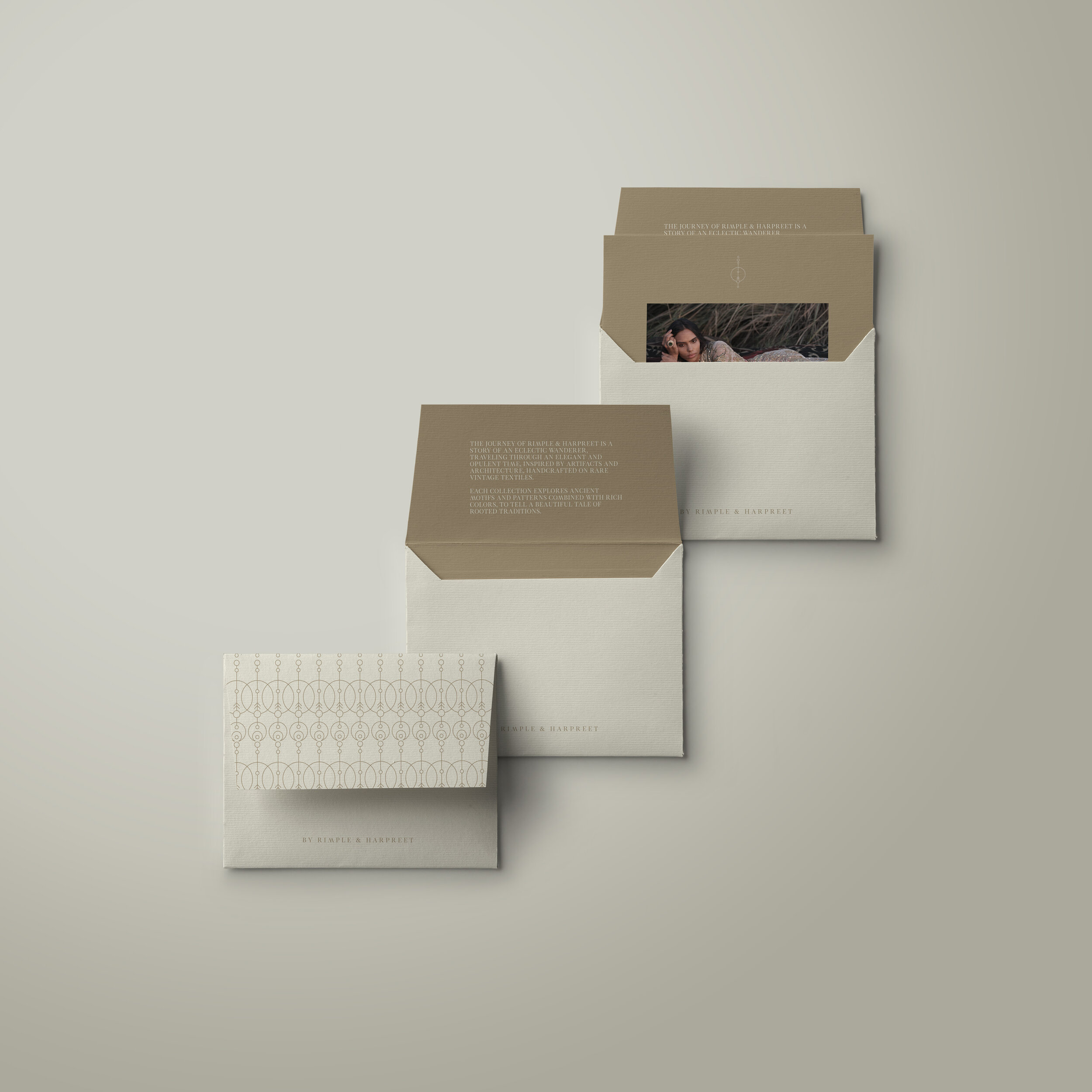
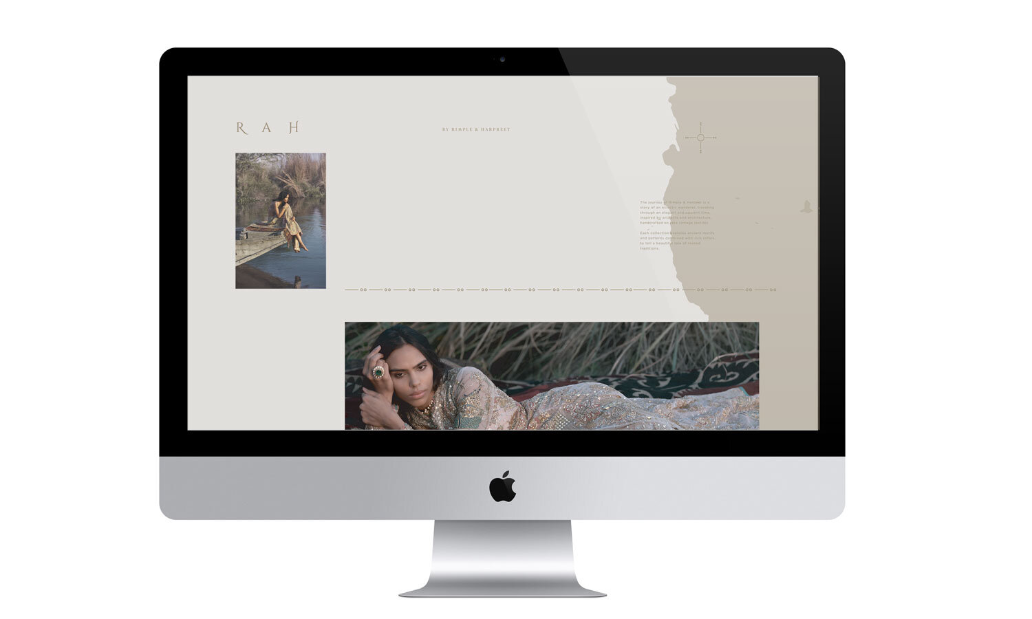
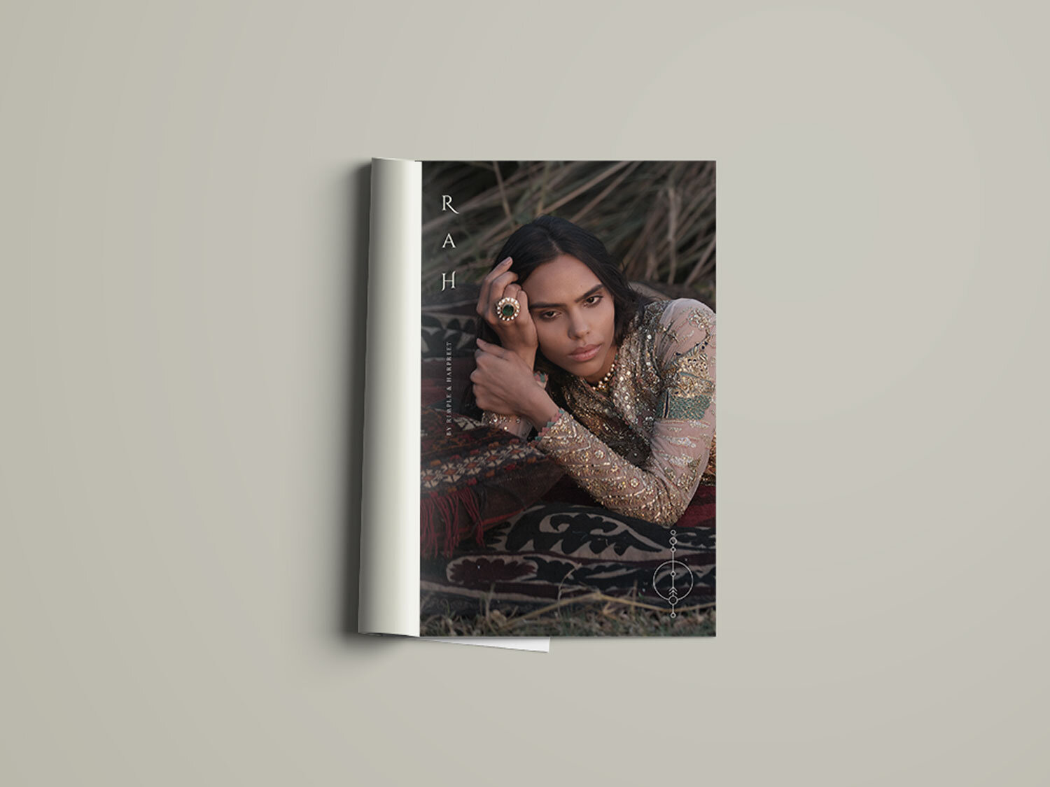
The journey of Rimple & Harpreet is a story of an eclectic wanderer, travelling through an elegant and opulent time, inspired by artefacts and architecture, handcrafted on rare vintage textiles. Each collection explores ancient motifs and patterns combined with vibrant colours, to tell a beautiful tale of rooted traditions.

Concept
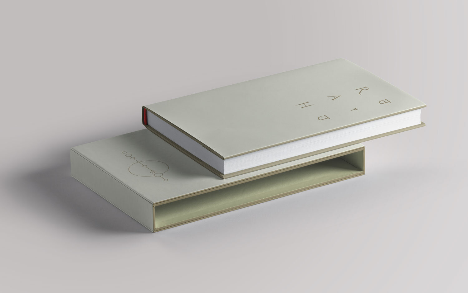
The brand inspirations are ancient travellers (our muse), cartography, objects and artefacts. In line with this theme, the brand name “RAH”, which means a direction or the road itself, was chosen. The logo is built as per the tenets of sacred geometry. Sacred geometry refers to symbolic and sacred meanings to specific geometric shapes and proportions such as monuments or altars. The space between the alphabets is intentionally added to give it a large scale and unusual look. The elements of brand language further incorporate cartography and navigation. The ancient process of mapping routes by utilising the positions of the stars, galaxies and constellations, are used as references for visual iconography.

Visual Identity
Each element is inspired by the old ancient travels and modernised for the new audience. Rimple and Harpreet Narula achieved this blend by visiting distinct cultures and communities within and outside India. It was as though they meticulously charted their path to many lands of untold wonders, immersed themselves in varied cultures and came back with the distilled essence of rich civilisations for inspiration. The campaign visuals personify their journey.

All creatives are developed while working at Illum Design Pvt Ltd.